The Problem
Business
As a business, Wim Hof would like to increase the rate of new users converting from a free to a premium paid plan during the 20-day cold shower challenge.
In order to increase conversion rates, the business believes their 20-day cold water shower challenge needs to be easier for users to complete with healthy metrics motivating new users’ progress, the ability to share with friends, and journal progress.
User
New users to the Wim Hof technique would like to easily set reminders, track their progress, and feel motivated to complete the cold shower challenge.
The Solution
Focusing on redesigning the experience for new users, we prioritised the following in our design decisions:
1. Guiding new users to the correct difficulty level
2. Sharing the benefits of taking part in the challenge ahead of the first session
3. Moving reminders from a 'paid' to a 'free' feature. Encouraging repeat use and consistency is an important lever to increase paid conversions.
Usability Review
We took stock of the current product experience with a usability review. Red stickies represent pain points and green represent 'wow' moments.
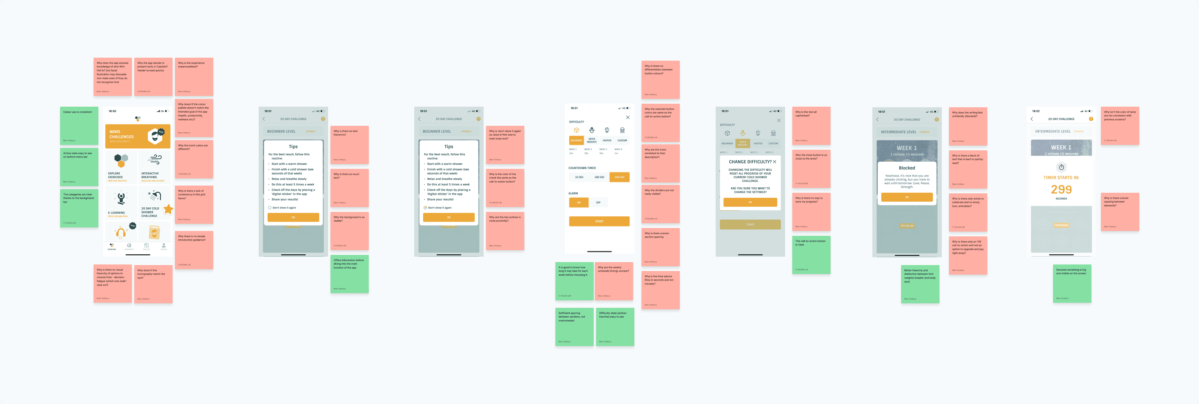

Business & User frustrations
Primary Frustration
When taking part in the 20-day challenge activity users are unable to track their health progress effectively which results in low positive habit formation.
Secondary Frustration
When first starting the 20-day challenge users are unlikely to remember to take daily cold showers which results in low product interaction and a high drop off rate.
Competitor Benchmarking


Problem Space
With a picture of the problem at hand starting to come into place, we jumped into the ideation phase and worked through the solution design model, identifying users actual behavior, and optimal behavior. This allowed me to form a how might we statement to begin forming a solution.
How might we help users be more consistent about their health practices?
How might we give users an opportunity to share their experience with friends?
How might we give users interesting, relevant and motivating metrics throughout the challenge?
Ideation
The we went suuuper wide with our ideation process. To maximise the number of ideas generated, we kicked off with mind mapping and following it up with crazy 4's.
After the creative juices had stopped, we grouped all ideas from both exercises to identify similar ideas.

Creating a mind map containing two branches. What can we improve to the left, and what can we add to the right.

Crazy 4's were a great way to get past the obvious ideas and explore the crazy.
What can we add
Creating an opprtunities for users to journal their experience and track the impact over time
What can we improve
Enable first-time users to set up reminders during cold shower challenge flow to improve consistency of use.
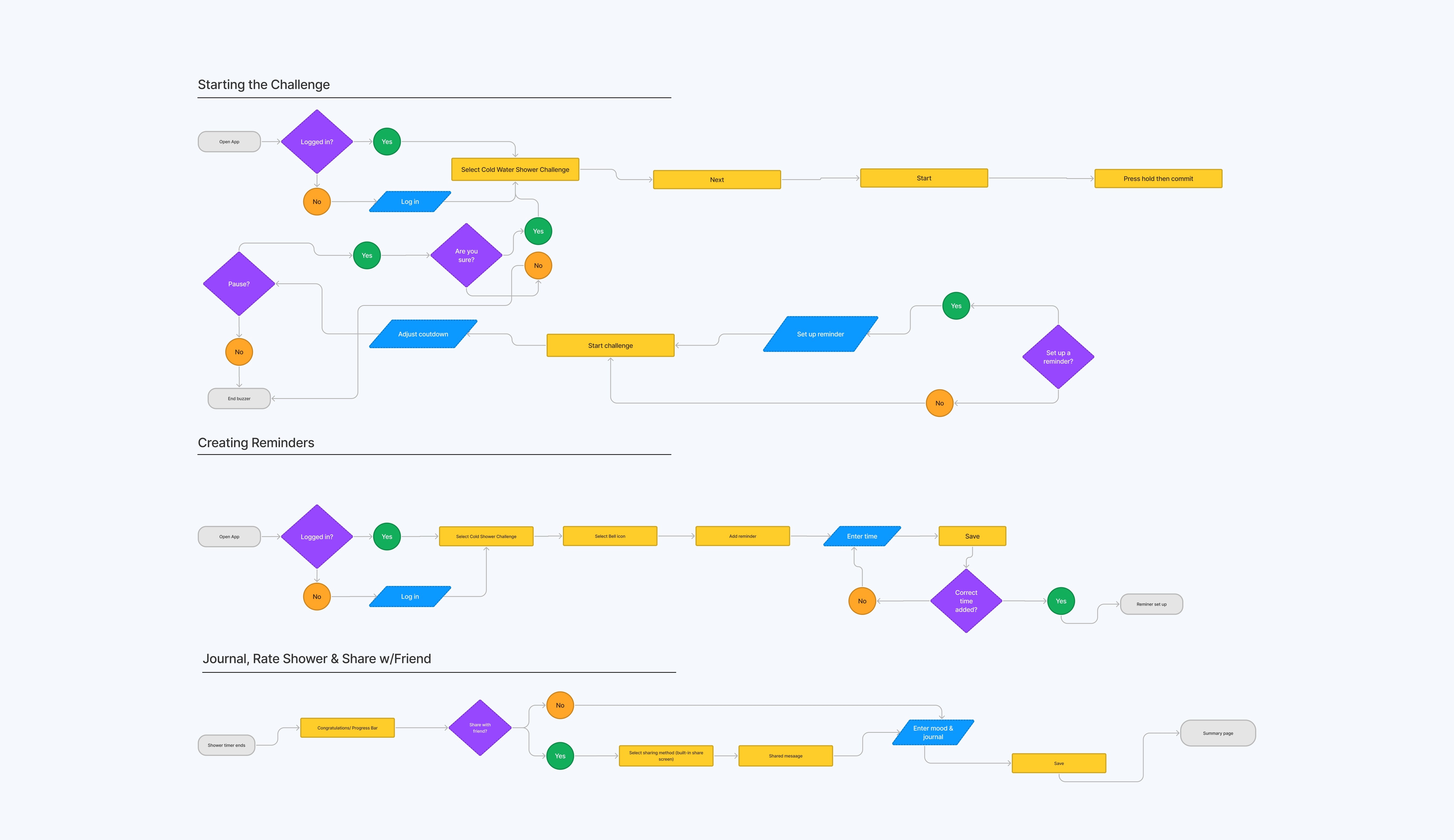
User Flows
We focused on redesigning the user flows to incorporate more guidance for users unfamiliar with cold shower therapy.
Furthermore, we hypothesised that building daily reminders into the optimal user path (and making them a free feature) would be key to boosting challenge completion numbers.
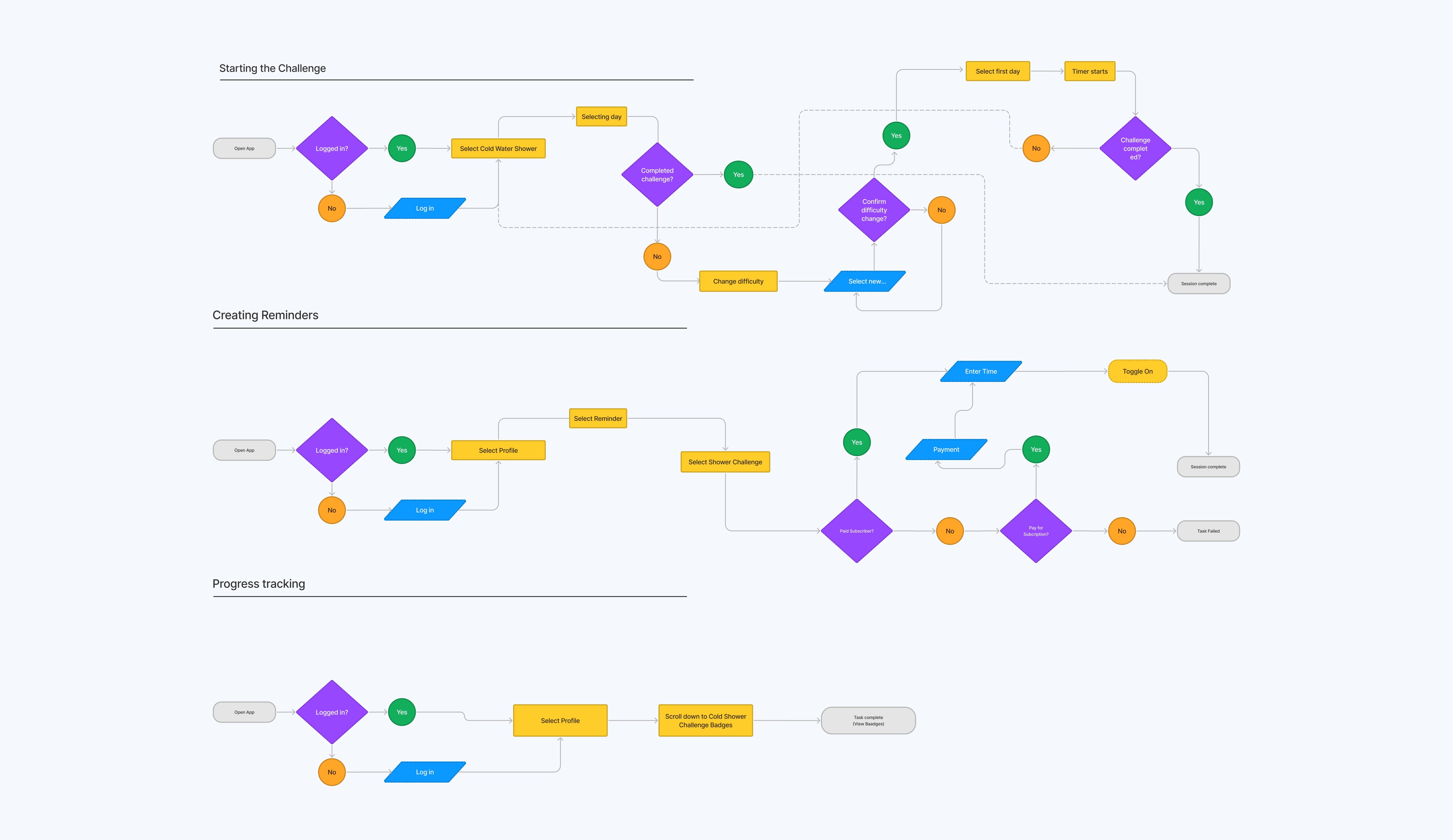
Existing user flows and redesigned user flows
Rapid Prototyping
Having mapped an improved user flow I spent time sketching ideas on paper. I kept pushing for as many variations as possible even when I felt comfortable with an early sketch.
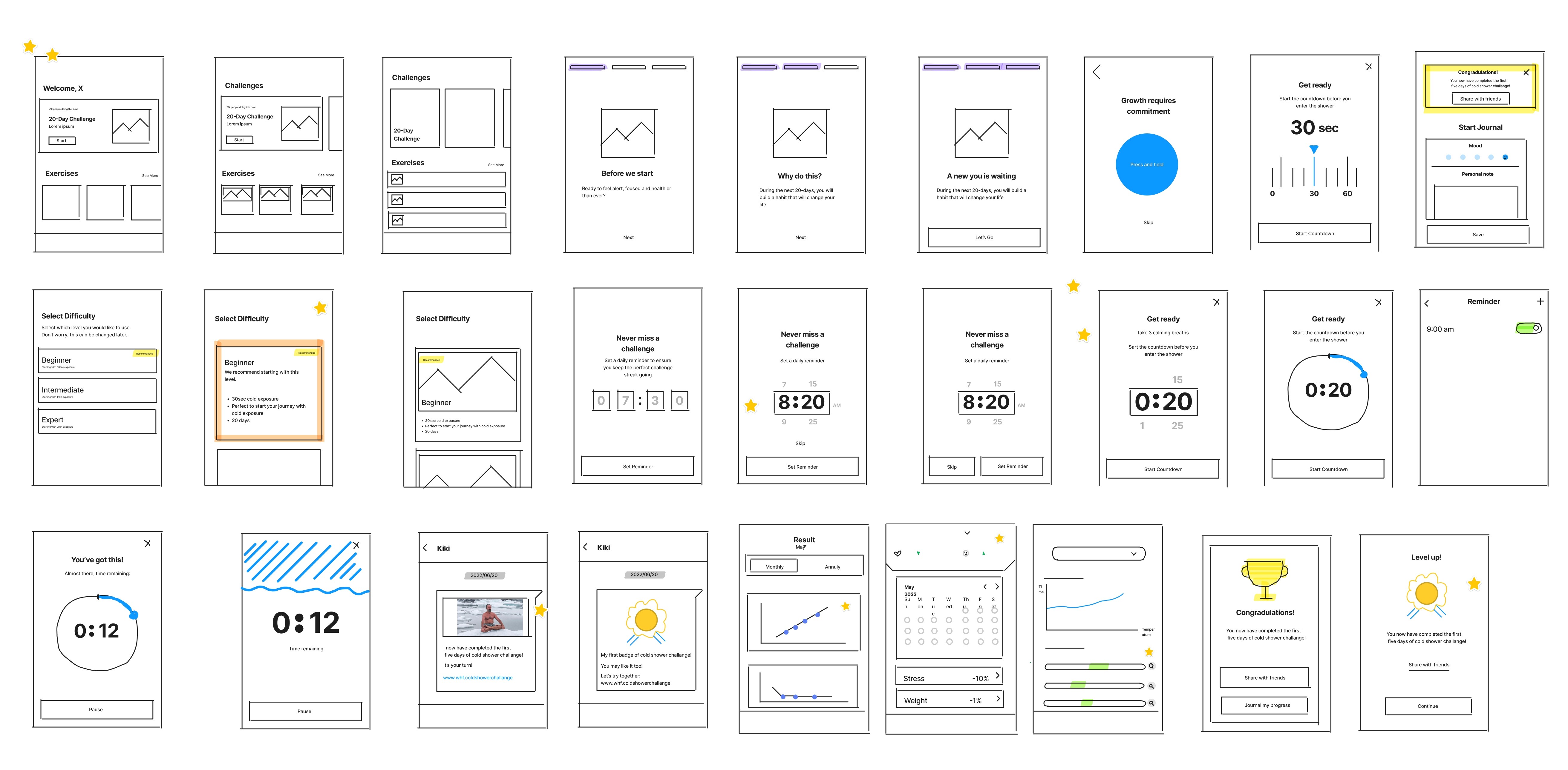
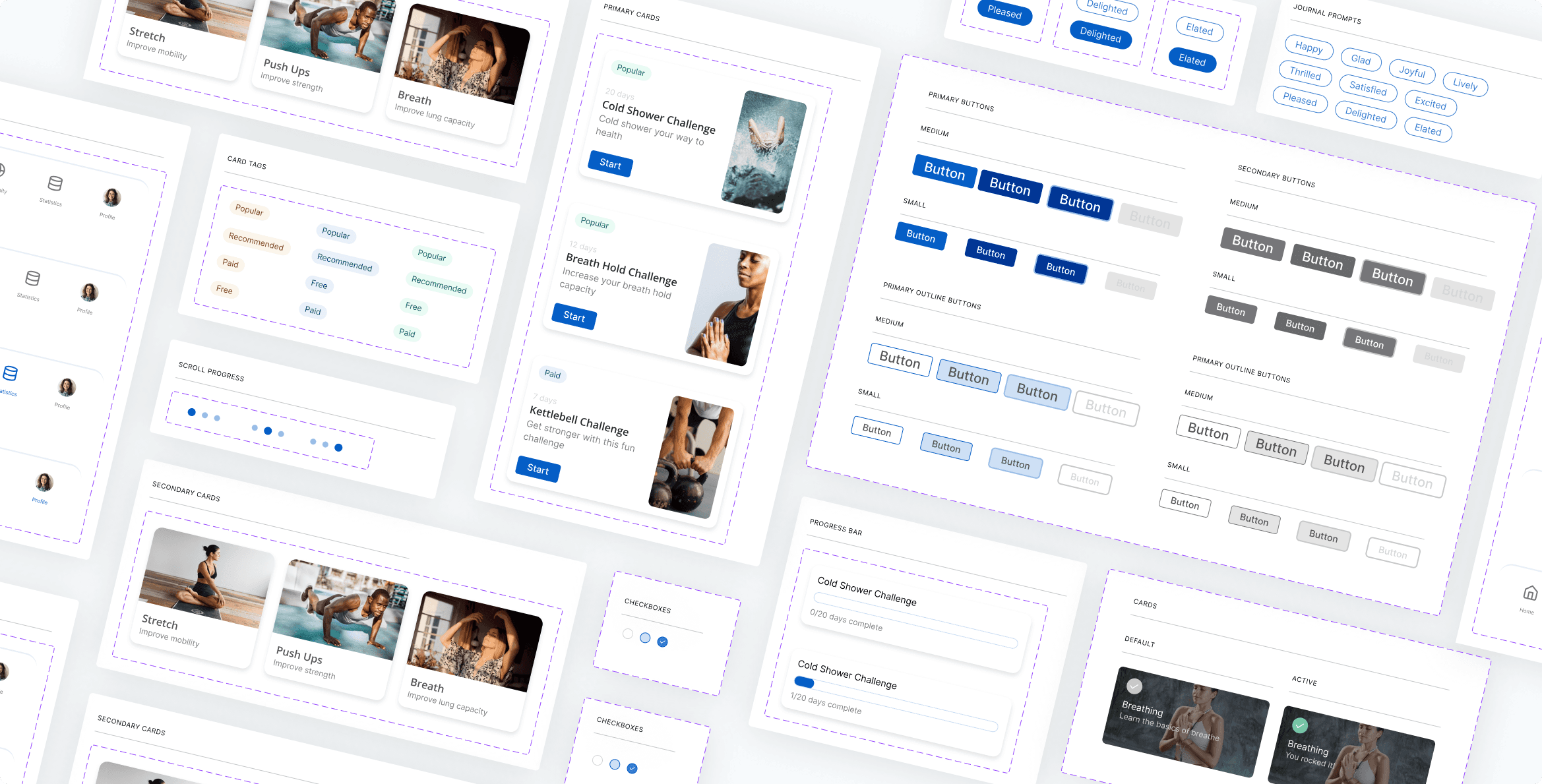
Styles & Components
Before creating a hi-fi prototype, I created a set of UI styles to ensure consistency and scalability. I established a new, monochromatic colour scheme for the product and opted for classic sans serif fonts.
Usability Testing
In order to find users, I posted within Wim Hof's subreddit and reached out to my network.
A total of 27 users completed all 10 steps which far exceeded the target number of 10.
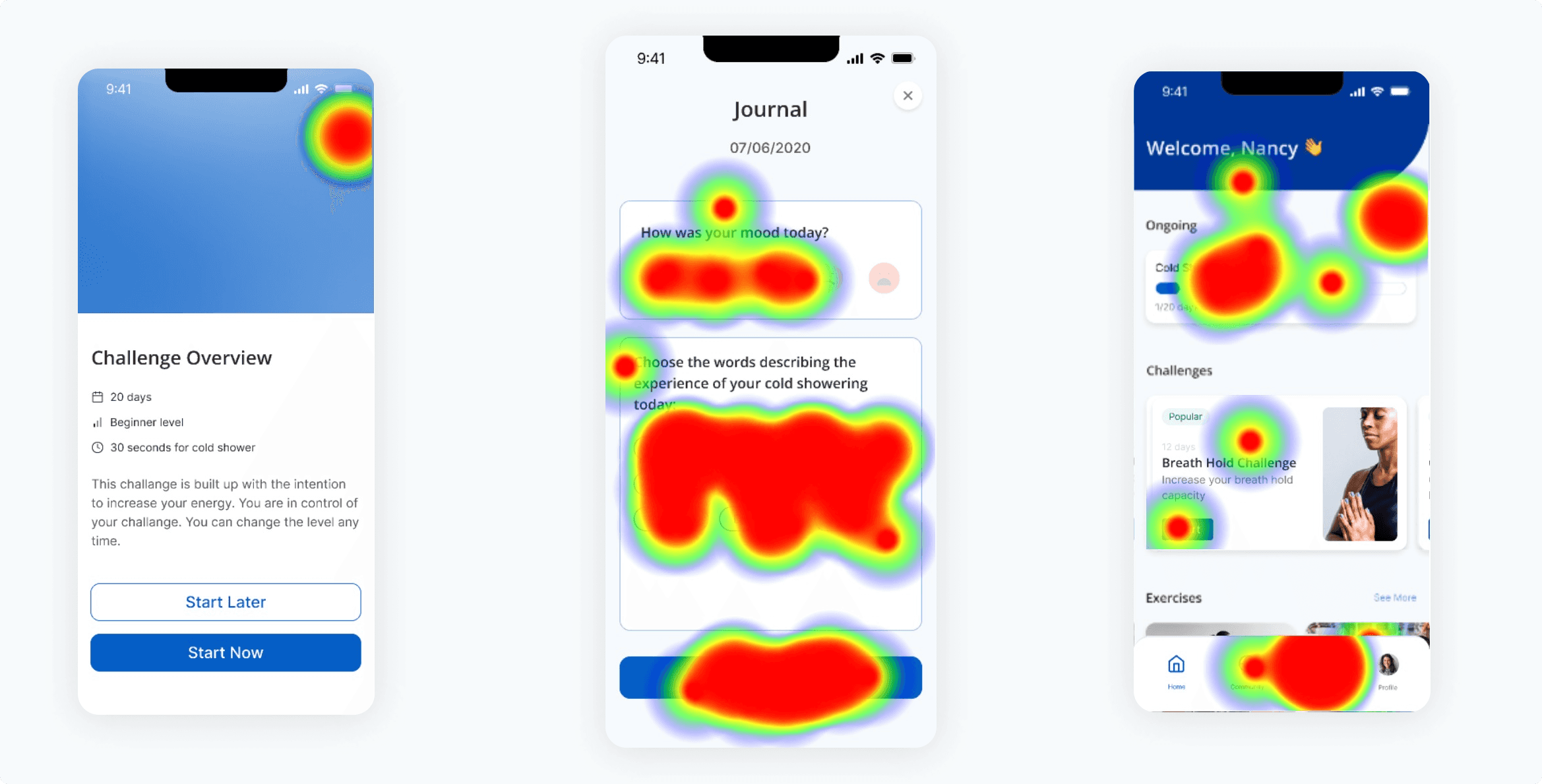
Heatmaps from usability testing with Maze
Test outcomes
Having tested the prototype, we learned which steps were causing users issues, and which flows had a sufficient task success rate.
Affinity mapping & prioritisation
In order to find patterns in the user's feedback we conducted an affinity mapping session, grouping similar patterns to identify themes.
Upon completion, we created a priority ranking of all themes from P0 (immediate) to P3 (low importance).
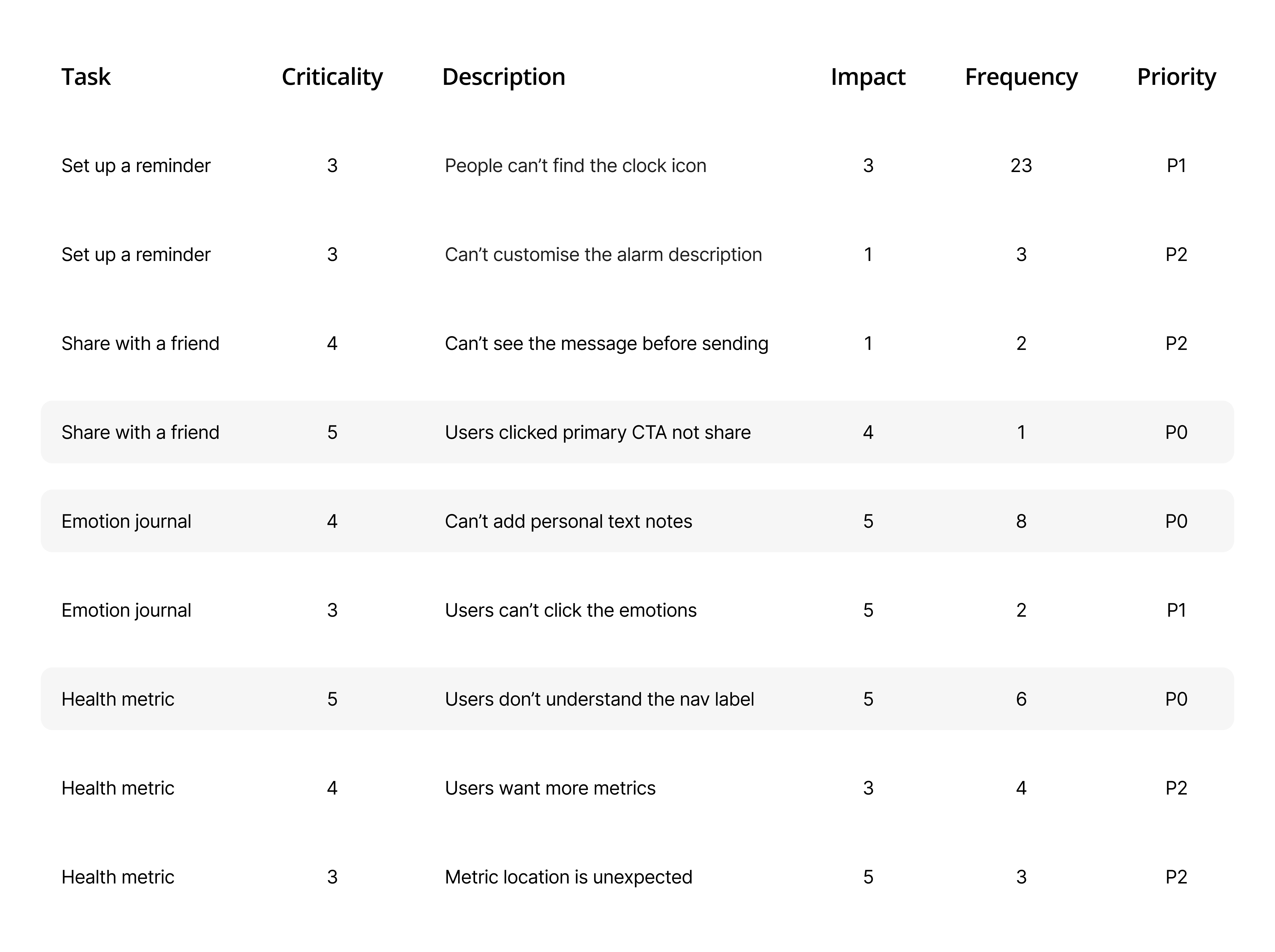
Prioritising tasks
1. Improving social sharing task completion by redesigning the visual hierarchy of the CTA
2. Including the optional field for personalised notes to enrich the journalling experience
3. Renaming 'Statistics' to 'Health Metrics' navigation to improve clarity

100% improved task completion following design iteration

Task success improvements for all three improvements
Next steps
WatchOS interface. The product exists in a unique context. The user is standing in the shower during part of the product experience, therefore exploring other timer trigger mechanisms such as Siri or Apple Watch to reduce friction is something that should be explored.
Measuring ROI. The business goal was focused around challenge completion rates and paid conversions. Tracking a cohort of users with the updated design implemented to measure the impact on both.
Community development. We incorporated social sharing into the new user flow, however, ideating more on the incorporation of community within the product is interesting. We hypothesise that enabling users to have a buddy join their challenge may help boost completion rates.
Key Lessons Learned
Challenge assumptions & iterate
Never be afraid to revist the problem statements as more information is unveiled. Being truly iterative means being brave enough to change assumptions rather than pushing forward on a flawed insight.
UI consistency is a fundamental for functional UX
It is not advisable to introduce a new UI style arbitrarily. Focus on design consistency throughout the entirety of the product experience.